


LOGO
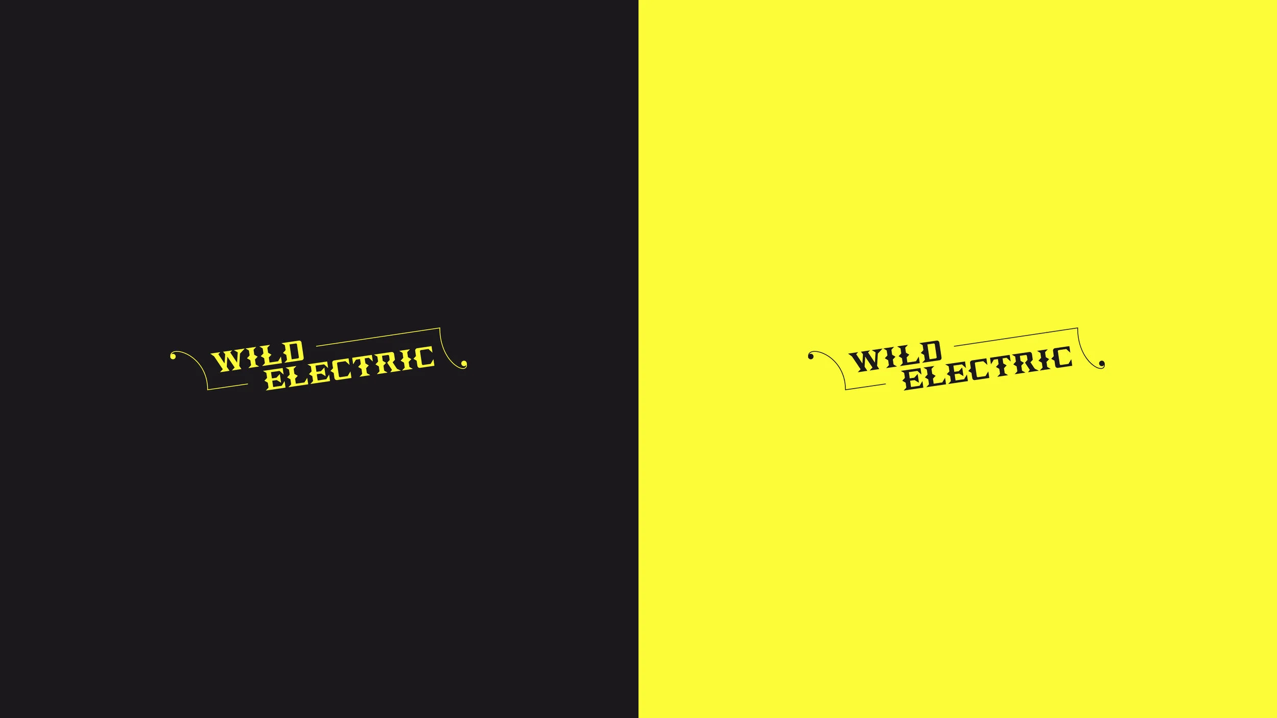
Two logos were created for the lifestyle brand. The full Wildelectric lockup and the abbreviated, and wildly appropriate, WE logo which became the recognisable symbol across social platforms.
TYPEFACE
The logo is based on a custom typeface drawn by me and appropriately recycled and reworked from a project I’d originally undertaken at university for a ‘manifesto’ project.
The original work was created by cutting out and stacking letters from a chunky slab serif typeface, by hand, with the intention of creating something new from the foundations of the old.
WE_MASTER_1920x1080_NO_MUSIC_SLOWER